Theme
Theme customization allows you to brand your surveys with your organization's visual identity. You can customize colors, logos, button styles, and layout elements to create a cohesive brand experience for your respondents.
Opening the theme dialog
To access theme customization options, open the theme dialog from your survey editor.
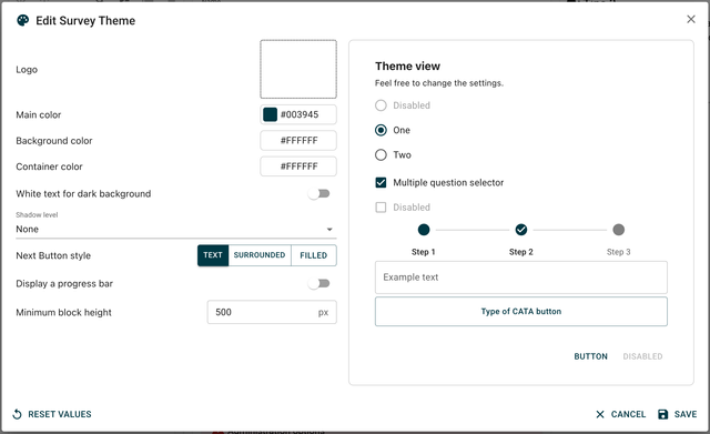
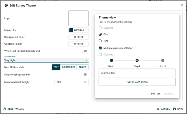
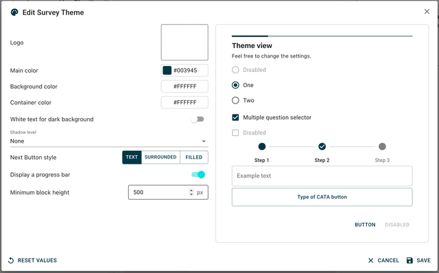
Custom preview You have a custom view at the right of the dialog that shows real-time preview of your theme changes as you make them.
Logo customization
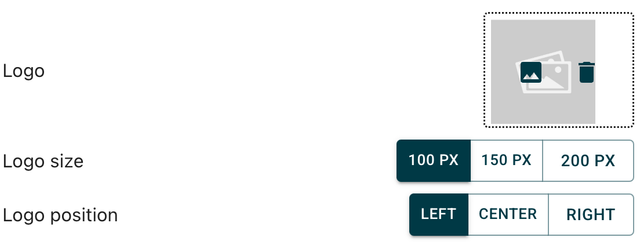
Adding a logo
Upload your organization's logo to personalize your survey branding. This image will be displayed on every block of your survey. This uploaded image will also be used as a favicon to personalize the browser tab.
Logo positioning
Control where your logo appears in the survey layout:
- Top left
- Top center
- Top right
- Custom positioning
Logo sizing
Adjust the logo size to fit your design requirements:
- Width: Set custom width in pixels or percentage
- Height: Set custom height while maintaining aspect ratio
- Scale: Proportional scaling options
Brand consistency Ensure your logo size and position work well across different screen sizes and devices.
Color customization
Main color
Set your primary brand color that will be used for key interface elements and highlights.

Background color
Choose the overall background color for your survey pages.
Container color
Set the color for content containers and question blocks.
Text contrast options
Configure text display for optimal readability:
Text in white on black
Enable high-contrast text display for better accessibility and visual impact.
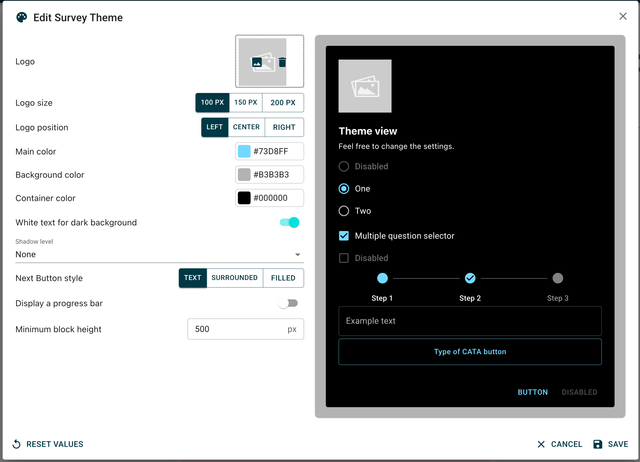
High contrast text improves readability for users with visual impairments and in various lighting conditions.
Container styling
Shadow level
Control the shadow depth for content containers:
- No shadow: Flat design approach
- Light shadow: Subtle depth
- Medium shadow: Standard elevation
- Heavy shadow: Prominent depth effect
Minimum block height
Set the minimum height for question blocks to ensure consistent layout:
- Maintains visual consistency across different question types
- Prevents layout shifts between questions
- Improves overall survey appearance
Button styling
Choose from different button style options to match your brand aesthetic:
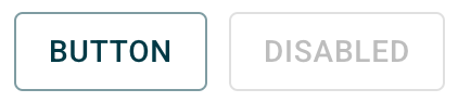
Text buttons
Simple text-based buttons without background or borders.

Surrounded buttons
Buttons with borders but transparent backgrounds.
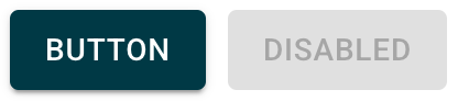
Filled buttons
Solid buttons with background color and optional borders.
Choose a button style that complements your overall design and maintains consistency throughout the survey experience.
Progress bar settings
Display options
Control whether to show progress indicators to respondents:
Show progress bar
Display a visual progress indicator showing survey completion status.
Benefits of showing progress:
- Reduces survey abandonment
- Sets completion expectations
- Improves user experience
Hide progress bar
Remove progress indicators for a cleaner interface or when progress tracking isn't desired.
Real-time preview
Custom view panel
The right side of the theme dialog shows a live preview of your customizations:
- See changes immediately without saving
- Test different combinations quickly
- Ensure visual consistency before applying
- Preview across different question types
Testing your theme
Use the preview to verify:
- Color combinations are readable
- Logo placement looks professional
- Button styles are clearly clickable
- Overall brand consistency is maintained
Applying theme changes
Once you're satisfied with your customizations, apply the theme to see it in action across your entire survey.
Always preview your themed survey on different devices and screen sizes to ensure optimal display across all platforms.
Page title
The page title in collect mode (name of the tab in the brower) can be changed by editing the following special key:
- LBL_PAGE_TITLE
Go to the translation module.